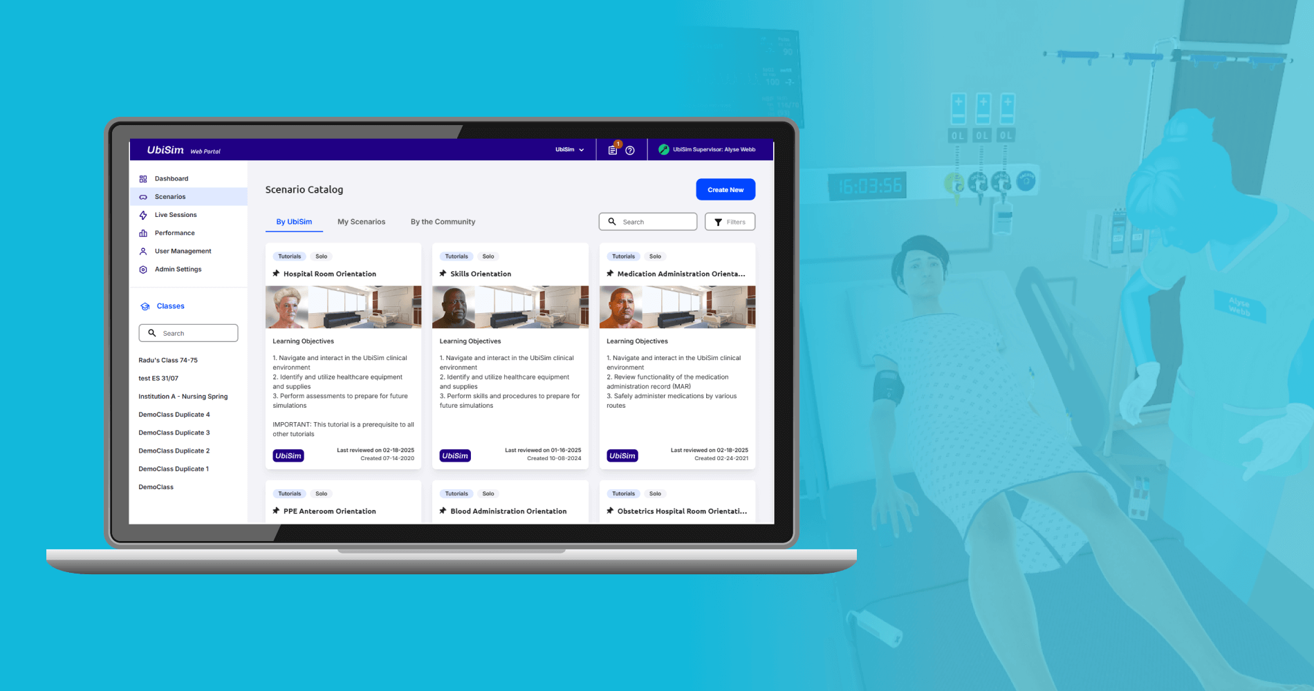
UbiSim Web Portal
UbiSim is virtual reality-based training software for nurses. The web portal is used for additional tasks including editing simulations and viewing training session results. With this long term role, I guided the platform through iterative design changes that responded to user needs.
Company
UbiSim
Year
2021-2025
Role
UX Design, UX Research & Testing
Product Strategy
The problem
UbiSim's web portal is used by learners, and educators to complete an array of related to the actual VR simulations. The portal was originally created by the software's engineers to include these tasks optimally from a development standpoint: without consideration of optimizing the flows for users.
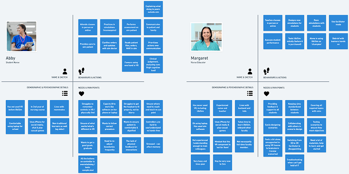
Understanding the target user
I built a clearer picture of our users and their needs within the platform firsthand via questionnaires delivered through the portal, face to face interviews and observational data in the form of hotjar heatmaps and recordings. I also collected and reviewed data coming from our sales and support teams. I created proto-personas from these which I reviewed and added to over time.
Service Map & Task Flows
With such a complex, existing platform, I identified key tasks and mapped their flows for different user types. This helped to clarify awkward points and where the flow could be improved per user type.

Information Architecture
User Stories
Changes I designed to the web portal fell into two key streams: feature changes and ux debt. The majority of the former were decided by the product team and based on industry needs research or from direct user requests. The majority of the latter were identified directly by myself through heuristic analysis with consideration to accessibility, with some coming through user support. Each item was created as a user story and tracked from design through development in Jira.
Example 1: Site Navigation
The web portal's site navigation suffered from several issues. Firstly: the contrast was insufficient to meet accessibility standards. A rebranding exercise introduced new colours I was able to incorporate to overhaul button and heading styles for enhanced accessibility. In addition, I made key structural changes.
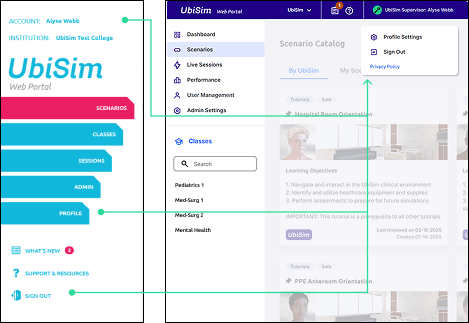
Account/Profile/Logout:
Hotjar showed users trying to click the account name before clicking sign out or profile. Grouped these actions under user name instead.
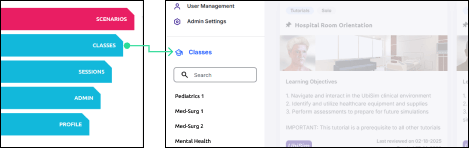
Classes:
For learners, simulations must be prepared for via the class: they always had to click classes then click the class from the list. I pulled the list out into the navigation instead.
Sessions:
Engineering-wise it made sense to group all sessions and divide them into live and past tabs. But for users these are very different functionally: I gave them their own tabs instead.
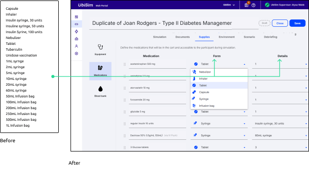
Example 2: Medications List
As the UbiSim Scenario Editor grew over time, some systems no longer worked well with the amount of content. For example, the selection of medication types grew into a lengthy dropdown. I proposed splitting the dropdown into two: a choice of form first (eg syringe or infusion bag) followed by the type or volume. This also allowed me to solve a second issue: a place to choose a number when the form is tablets or capsules.
Example 3: Left/Right split
Settings for the virtual patient in UbiSim are quite detailed, and controlled through a series of dropdowns and toggles. I envisioned a very visual interface but there was no time to build this tool. So, as a quicker fix, I divided the dropdowns into left and right side of the body. This not only used screen space more efficiently than listing them after each other but is easier for the target audience to use and self-check because it aligns with nursing best practice in which comparing left and right sides of the body is extremely important for assessment.
User Feedback
These changes were generally launched with only internal testing. However, Hotjar and other feedback mechanisms meant we constantly checked user reception of changes and could respond quickly. We overwhelmingly received very positive feedback about how easy to use the platform was.
Final Thoughts
The great thing about working long-term on a living product is the opportunity to evolve the platform in response to changing user needs. The tricky part can be keeping strong processes in place while remaining agile. Overall, I am very proud of the way I helped transform the platform and keep usability a priority for both new features and maintenance.