UbiSim VR
UbiSim is immersive, virtual reality-based training software for nurses. It runs on meta-quest headsets using hand controllers. With this long term role, I guided the platform through iterative design changes that responded to user needs.
Company
UbiSim
Year
2021-2025
Role
UX Design, UX Research & Testing
Product Strategy
The problem
UbiSim's software was originally created by engineers and 3D artists, without a ux process to guide the design. While it was overall a very effective experience, there was inconsistency between interactions, and insufficient controls orientation for a target user group who tend to be inexperienced with VR and gaming in general.
A VR design system
Virtual Reality is an excellent platform for practicing key nursing skills including recognizing symptoms and practicing empathy. However, the controls are not well suited to tasks involving fine motor skills: so we simplify these steps. For example, learners must select the correct medication and site on the body to give an injection, but the injection itself then occurs automatically.
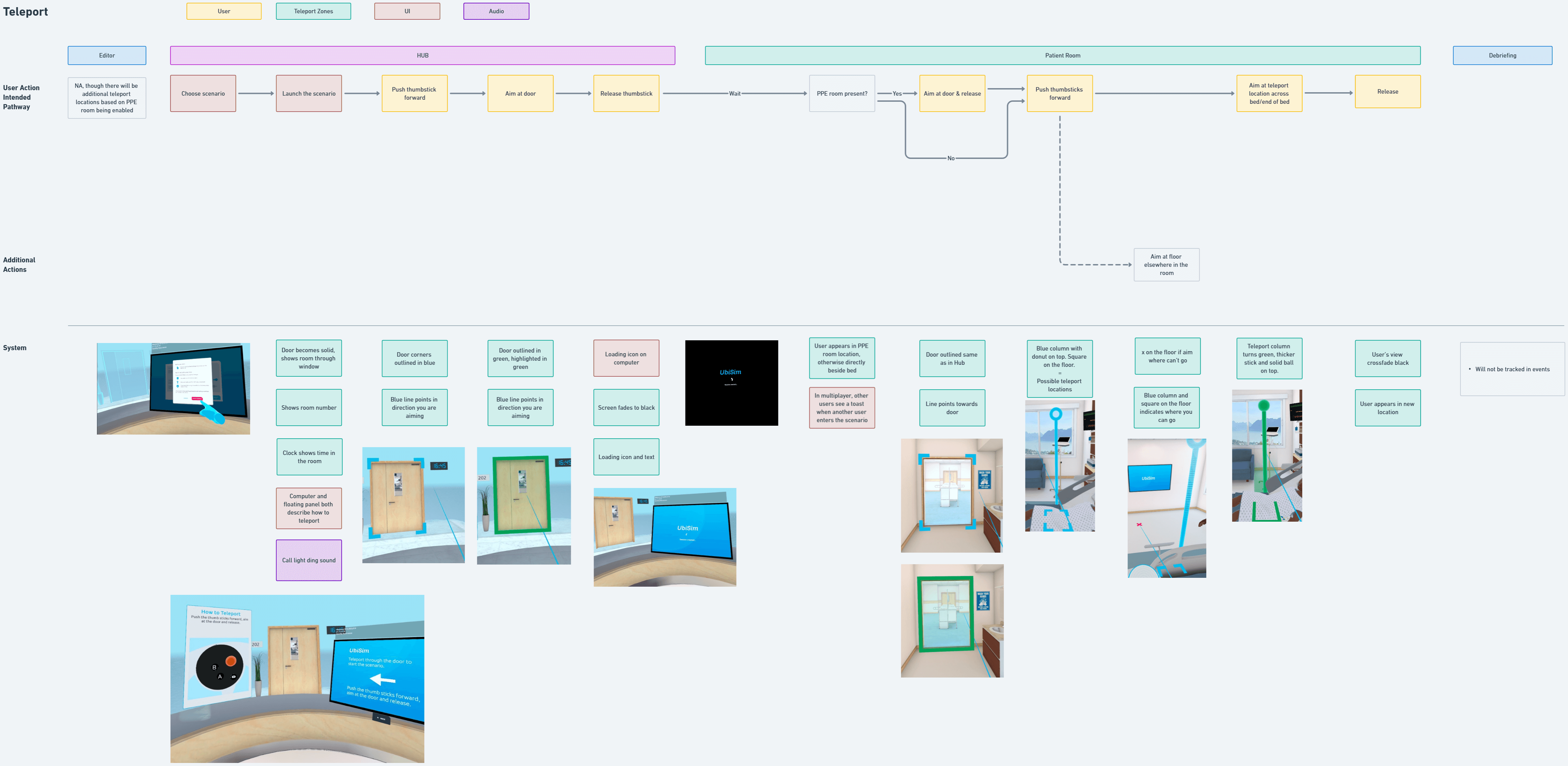
To keep new features consistent and aligned to making the most of the platform, I created a 'game loop' flow map and a detailed reference matrix for all interactions.
Design of a New Medical Feature
Research and Discussion
New medical features such as symptoms and equipment were regularly added to the software. I worked closely with our nursing consultants to understand the real-world version then determine how to translate it into virtual reality, designing with consideration of the aforementioned system.
Flow Map & References/Mockups
Next step was creating a flow map for the new interaction, incorporating visual references and any required interface mockups as references here. This flow was workshopped with nursing, art and development to ensure technical feasibility and accuracy. It then served as a reference for all team members throughout the development and testing process.
Testing
New features were tested at several points during the development process, getting into VR to test early prototypes as soon as possible with nursing, QA and myself. I would have liked to incorporate user testing also but this was not budgeted for. Fortunately, we regularly received very positive feedback about how easy to use the platform was.

UX Debt: Teleportation
Identifying and understanding the issue
By reviewing a large set of UbiSim user session recordings (taken within the headset), I identified some usability issues. The biggest struggle seemed to be with the teleportation mechanism, which of course does not have the same real-life intuitiveness (move and grab!) as most other interactions.
Teleportation has become the preferred locomotive mechanism across VR apps, for its ease of use while avoiding motion sickness. While owners of a headset quickly become used to it, our target audience are students who may only use VR in UbiSim when at school, as little as a few times a semester. I recognized two issues: learners struggled to aim, and struggled to remember what to push on the joystick.
Comparative Research
In comparing VR apps, I identified two main types of teleport: free (users can jump to any location) and zoned (predefined locations). UbiSim used zoned teleports (preferrable to keep learners focused and able to reach equipment and the patient), but required users to aim down at the floor: more akin to free teleport.
I also found the best orientational experiences allow users to practice required mechanisms in a streamlined, yet themed space before entering the main experience. This serves a mental bridge between real and VR worlds and prevents users being overwhelmed and frustrated.
Flow map and mockups
I designed a simple flow and storyboard-style mockups to convey the intended design of a new orientation space and teleport UI.
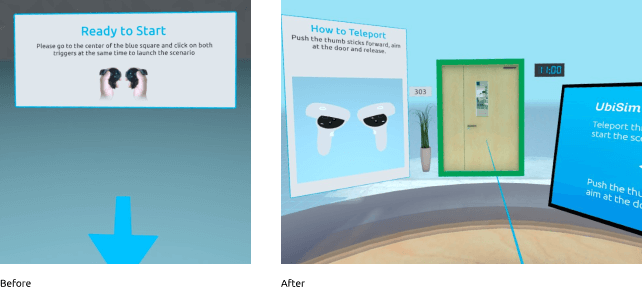
Design
Previously, learners started in an empty space and needed to press two buttons to start: an action that is never repeated when in the simulation. Now, users arrive at a simplified hospital space with a desk and patient room door. Users are instructed how to teleport and must do so in order to begin the experience: so they can learn or be reminded how before the additional pressure of the simulation itself.
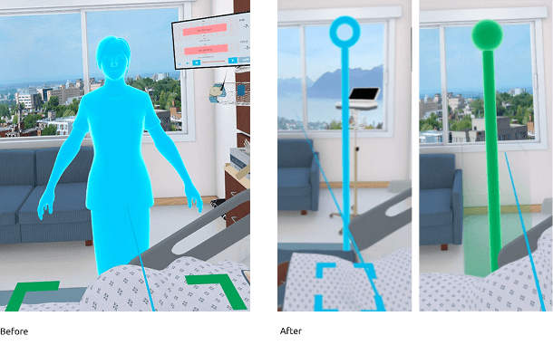
When attempting to teleport, learners were previously required to aim at the floor and shown a full body avatar preview for where they would go. Frequently, they would aim up at it only to be confused when it disappeared! I swapped the avatar with a simplified column with a clear selected state, and allowed aiming along the full vertical axis.
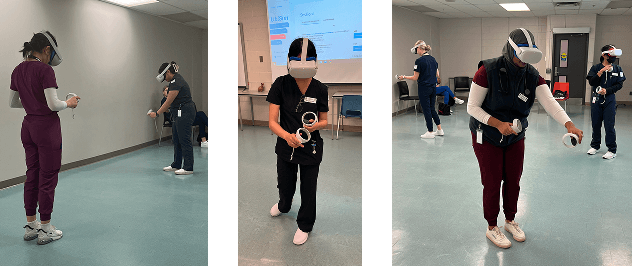
User Testing
I used a site visit to one of our clients (Fanshawe University) to conduct user testing of the orientation and teleport mechanisms. Observationally, I saw users experience minimal issues, and questionnaires showed users found the experience very intuitive and enjoyable.
Final Thoughts
The great thing about working long-term on a living product is the opportunity to evolve the platform in response to changing user needs. The tricky part can be keeping strong processes in place while remaining agile. Overall, I am very proud of the way I helped transform the platform and keep usability a priority for both new features and maintenance.