Myant Website
Myant embeds technology into clothing and other textiles, designing its own products as well as working with other clients interested in smart textile technology.
Myant has a human-centred vision of providing access to health and support systems in a form factor that is comfortable and easy to use for everyone. The site strives to present both its business value and this mission.
Visit SiteCompany
Myant Inc
Year
2019
Role
UX, UI, Art Direction
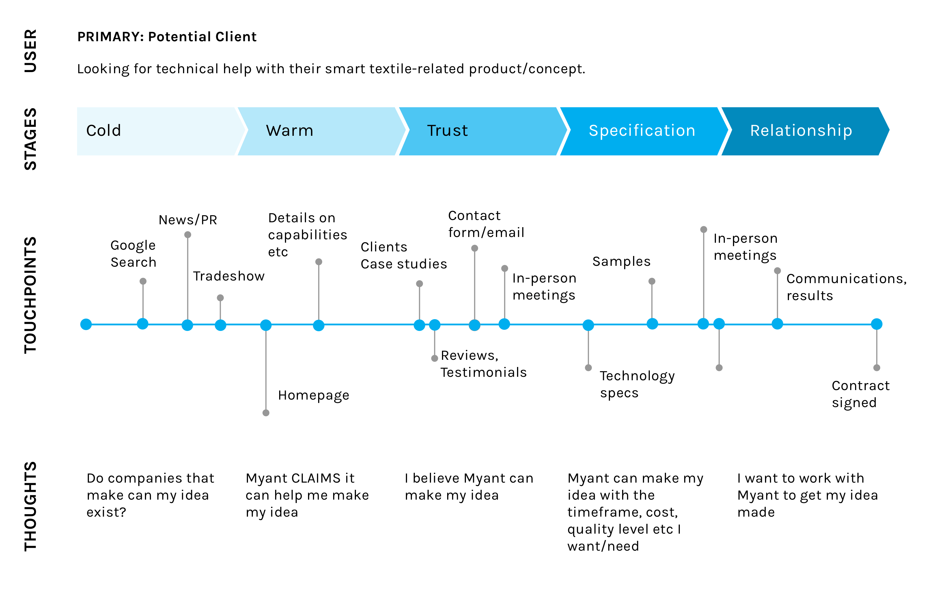
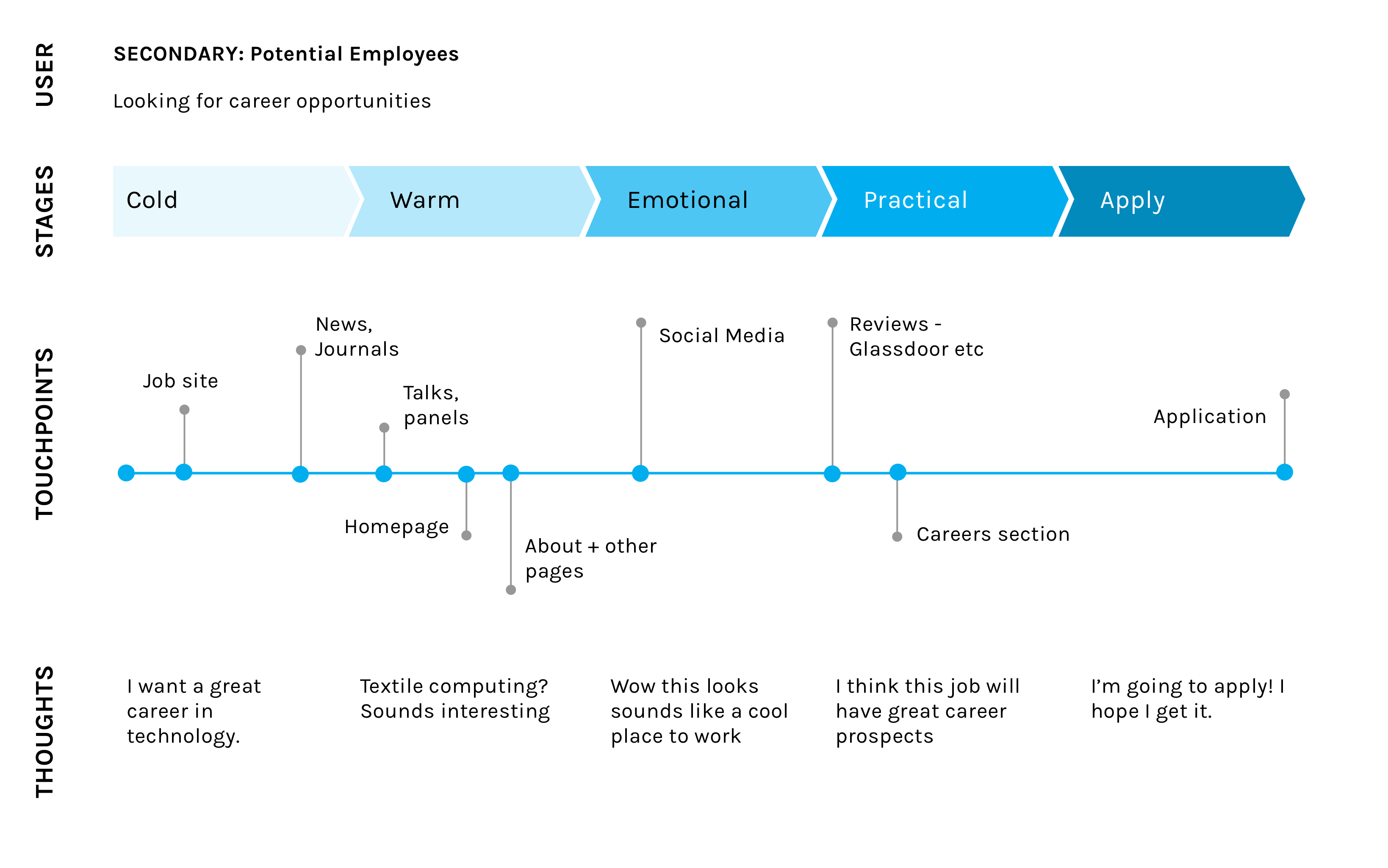
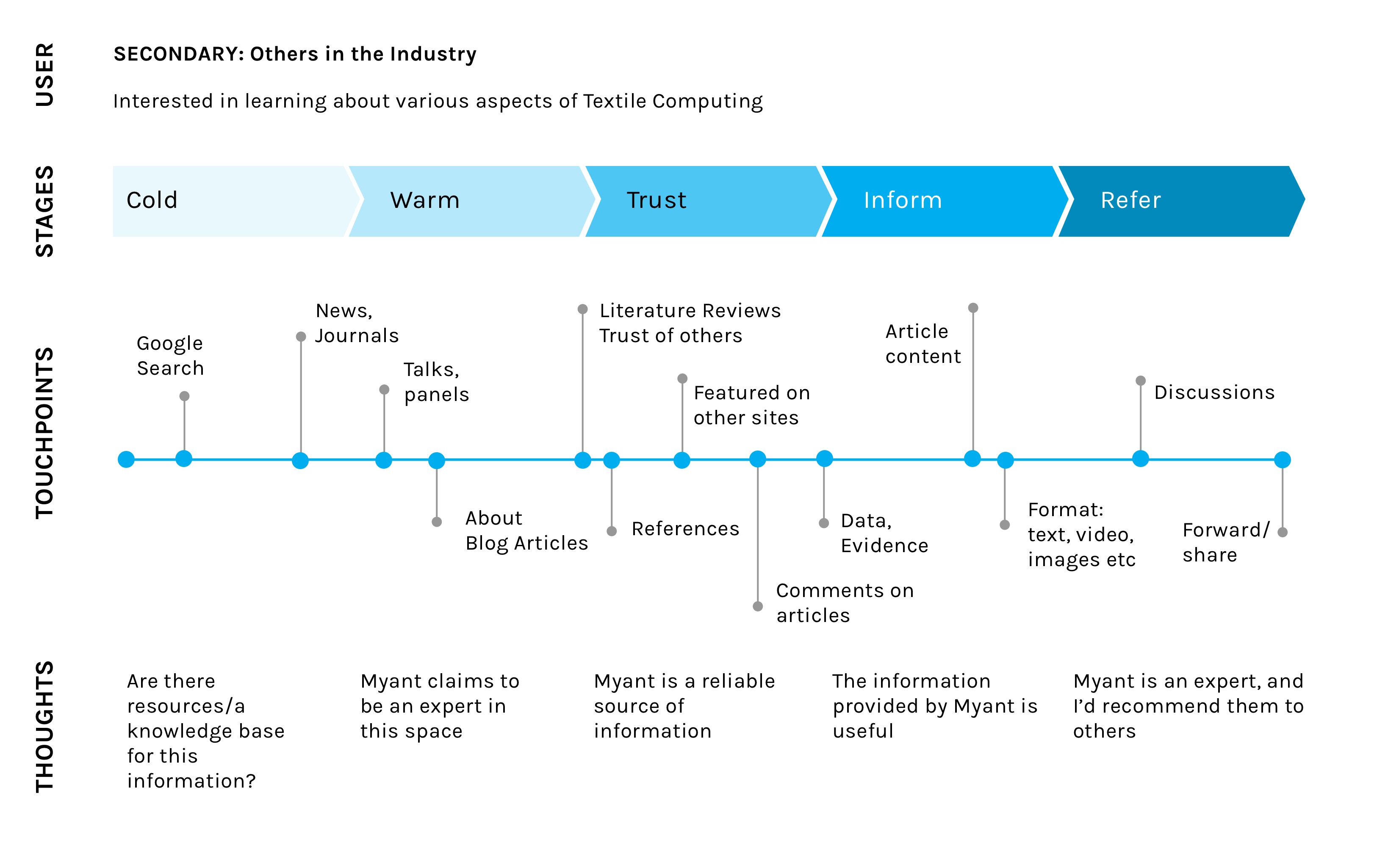
Journey Mapping
Previous site content and layouts had been determined from the perspective of the company only - what do they want to say about themselves. While of course important, the primary consideration should be the conerns of potential users. If they do not find what they are looking for, they are likely to give up and leave without contacting Myant. That's where journey maps come in.
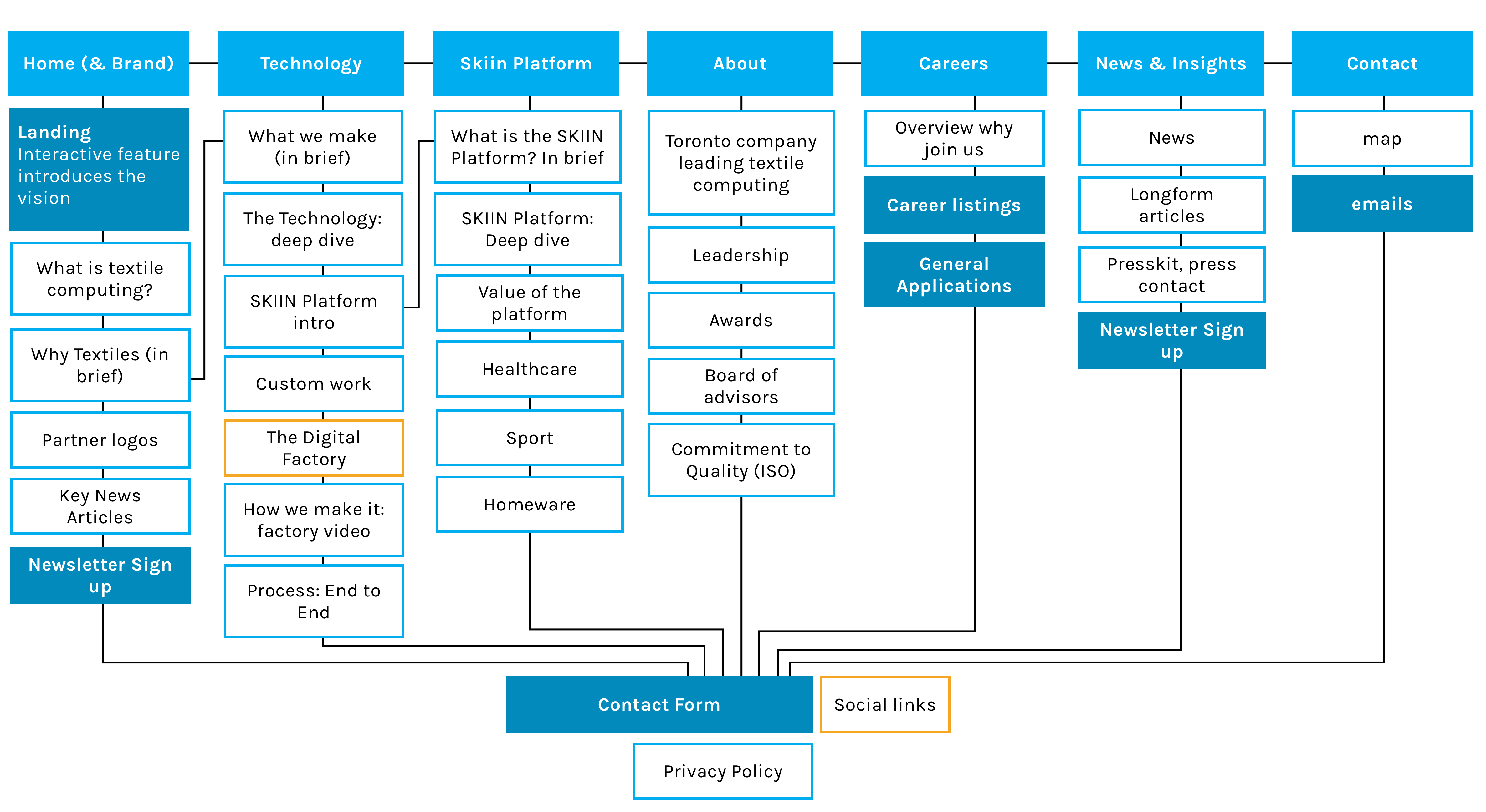
Site Hierachy
Focused on the needs of the primary user (potential clients), while also considering secondary users (others in the industry, potential employees and journalists), I organized the new to prioritize key questions and information categories in the navigation.
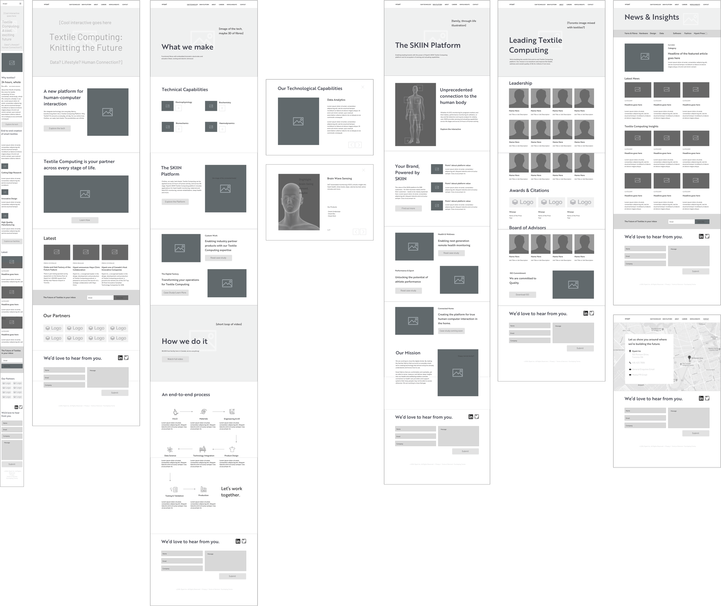
Low-Fi Wireframes
The site redesign involved input other content-creators in the company - the copy writer, graphic designer, the social media marketer, the director of partnerships and stratgies (who has created many presentation decks to deliver the company’s evolving message beyond the company) and more. I created wireframes to share the site plan at an early stage, and get input for the content.
Colour & Visual Inspirations
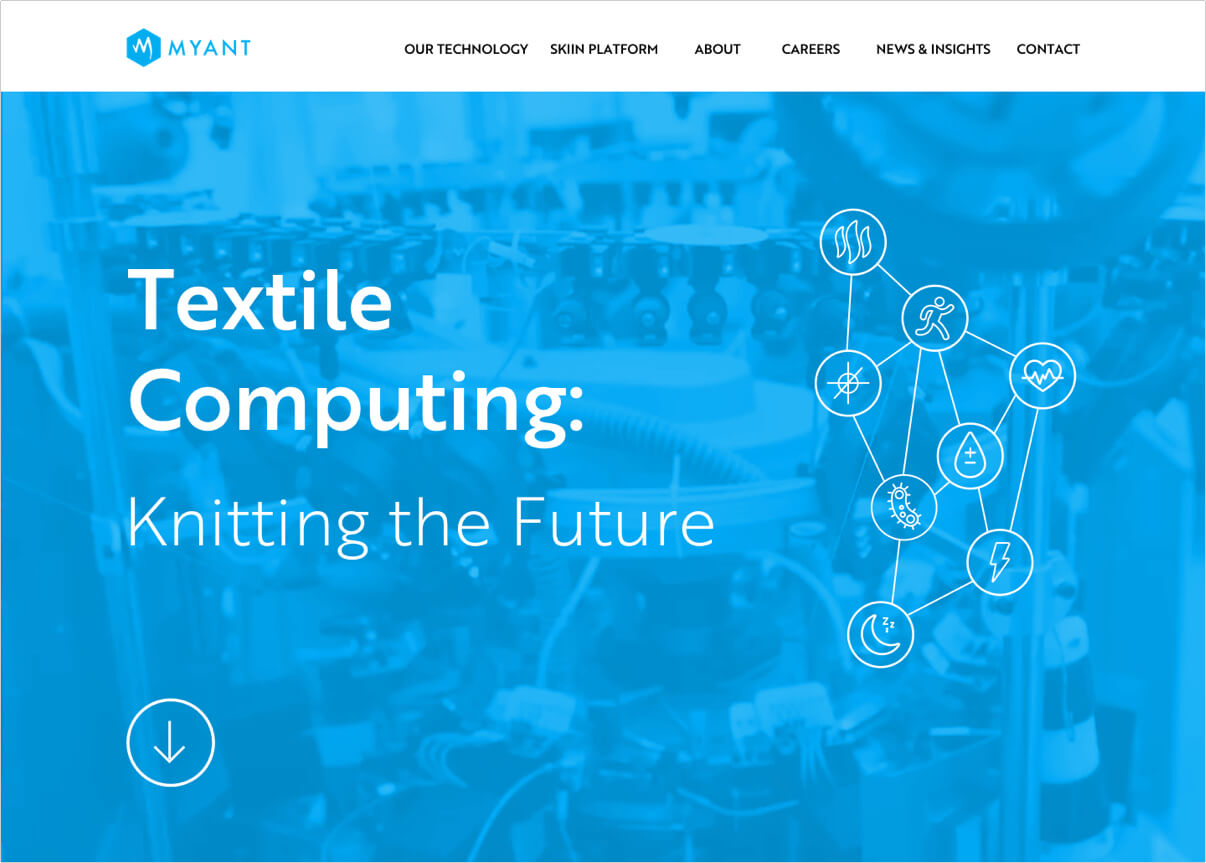
Myant’s brand colour was established as cyan blue: for its associations with technology and digital businesses. However, Myant always strove towards a human-focused mission, and reyling only on this colour led marketing materials and presentations to feel cold and unwelcoming. I added a warm orange as a secondary highlight colour to help offset this, as well as introducing playful rounded shapes and stitch elements, referring to the company’s textile basis.

Site Dissection: UX & UI
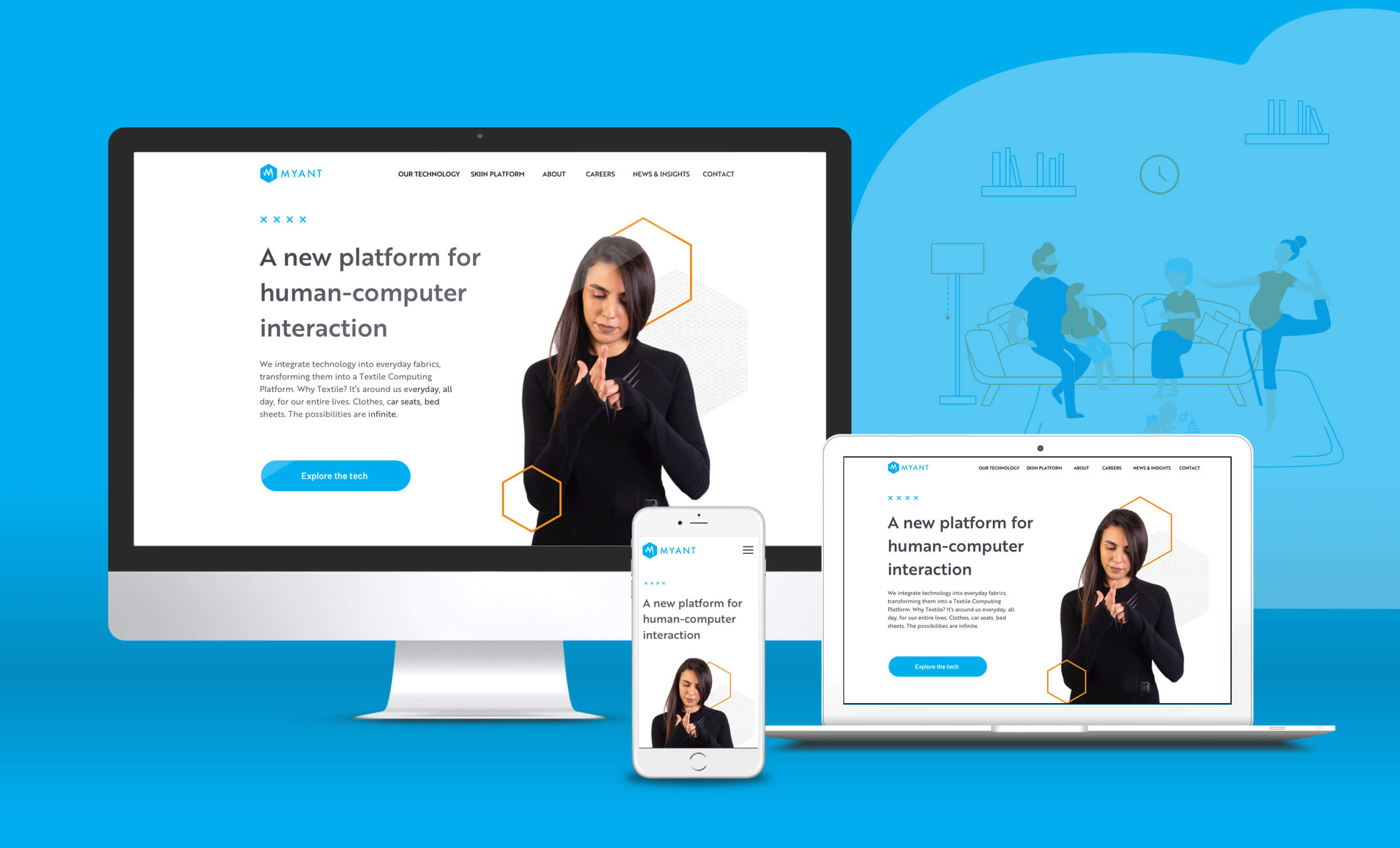
Splash
The splash includes introductory text, background video and connected icons, with an arrow to invite the user to explore more on the site. The text should be enough to confirm for ‘warm’ visitors that this is the right site, and to intrigue new visitors.
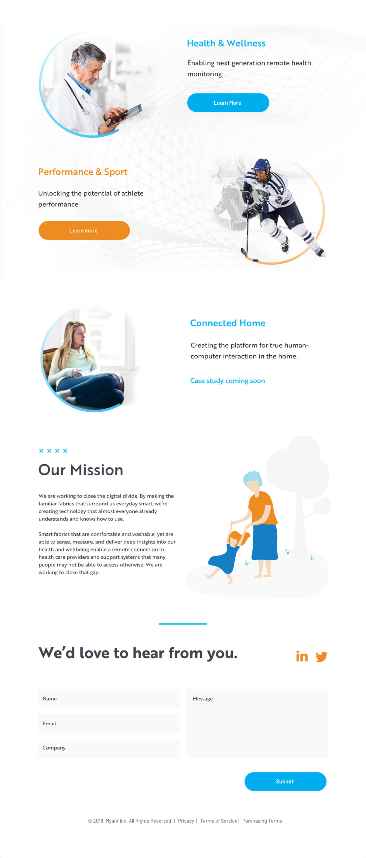
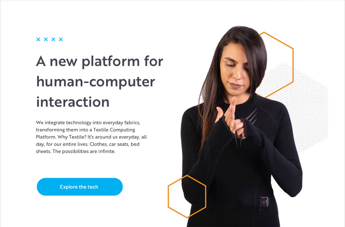
Humans & the technology
I felt it was important to put humans front and centre, wearing the technology! I was not able to have new photos taken for the news site, but needed to use existing imagery.
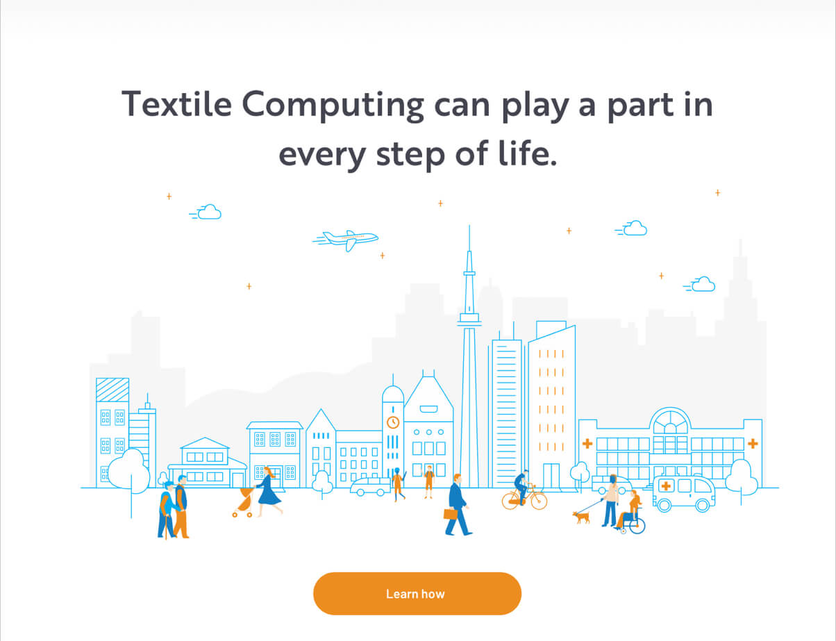
Illustrations
Myant’s vision is to create seamless textile technology across many applications, for everyone. These illustrations serve to introduce this concept in a friendly way. The illustrations were created by Myant's graphic designer with my direction.
Icons
I designed light and airy icons, to fit with the rest of the site’s feel. I mixed the two colours together to add liveliness.
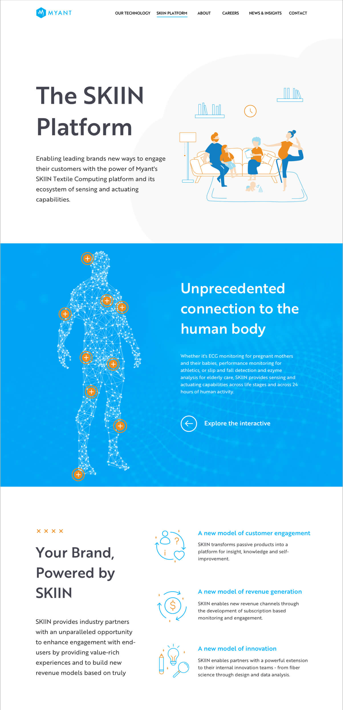
Modal Content
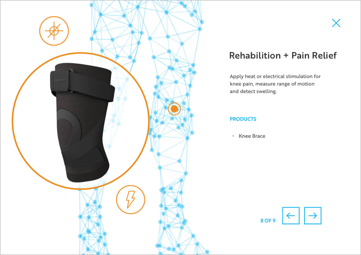
In two sections in the site, there was a huge amount of content that stakeholders wanted to include. I laid this out as interactive sections (eg the abstract man with the + buttons) that invited the user to click to explore for more in-depth content within the modal.
Stock Imagery for Industry Applications
In order to illustrate concepts for which I had no imagery, I used stock, but edited the images to fade the backgrounds to black and white.